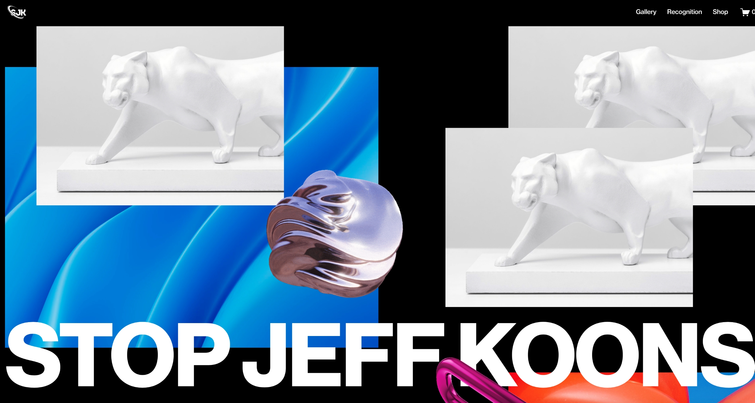
Some might argue that there is nothing more ominous than the prospect of any more art produced by Jeff Koons (me, I have argued this nearly continuously). But this week, we learn about the prospect of something even more terrifying: a lot more art that is reminiscent of Jeff Koons. This horrific realization accompanies the announcement of a new partnership between the artist and website-building platform Squarespace, which offers users an exclusive template, Reflect, to present their own “universally appealing” ideas through a “Koons-inspired” filter.
The project is twofold, with Squarespace also debuting a Jeff Koons website that chronicles four decades of the artist’s prodigious output “to display his expansive body of work and make it accessible to anyone anywhere,” according to the partnership’s promotional language. This feels like a terrific opportunity for Koons to finally get some exposure! It’s notable that this dedicated website employs Squarespace’s cleaner and more easily navigable features, and seemingly none of the less functional template elements offered by Reflect, which include many, many Flash animations, the likes of which we haven’t seen since the early 2000s. Because that’s about when everyone realized that they were an absolute nightmare for browsers and viewers to deal with and classified them as a verboten internet practice. Of course, Koons wouldn’t want this new website to contain, say, a rotating metallic carabiner, because it would probably crash the browser of his target audience — the few remaining people on Earth who somehow remain blissfully unaware of Jeff Koons, due to living under a huge rock with very unstable internet connection. I’m all for it, frankly. If we can’t be happy, then neither should they.
Squarespace has built its brand by claiming to be a platform for creative individuals to set up one-stop web representation for themselves. With this and other guest templates, including collaborations with Björk and Rick Rubin, the focus seems to be migrating toward encouraging users to instead co-opt the pre-established aesthetics of visionaries (and Jeff Koons). As with the other featured collections, Squarespace produced a short video about the process of building the Koons website (TW: This video begins with a shot of Koons pumping a balloon to erection, which is hard to unsee once it’s happened.)
In the video, Koons answers provocative questions like “What makes art, art?” and then suggests that this online warehousing of his lifelong oeuvre makes it even more accessible than it already was, thereby furthering his goal of making art that is for everyone.
“You can take the design from this collaboration,” Koons says in the video, “and incorporate it into your own website.” How does the old saying go? Good artists copy, and great artists incorporate generic Jeff Koons layout elements into their own websites.
Unfortunately, we do not get access to all of Koons’s imagery, because I believe some Flash animation from the Made in Heaven series of the late ’80s and early ’90s would really drive business to my artisanal candle store. Nonetheless, I did the best I could to use Reflect to design my own website, for an idea that has just occurred to me, apropos of nothing: a society to STOP JEFF KOONS at all costs. If I’m being honest, the results aren’t half-bad! (They are all-bad.)

