
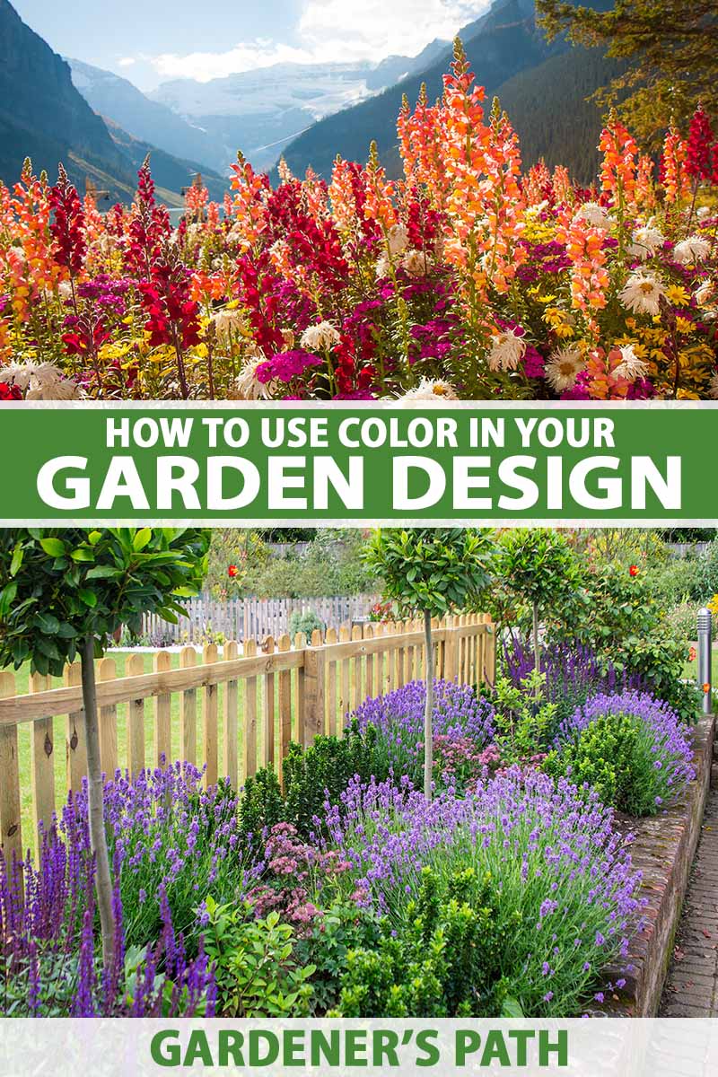
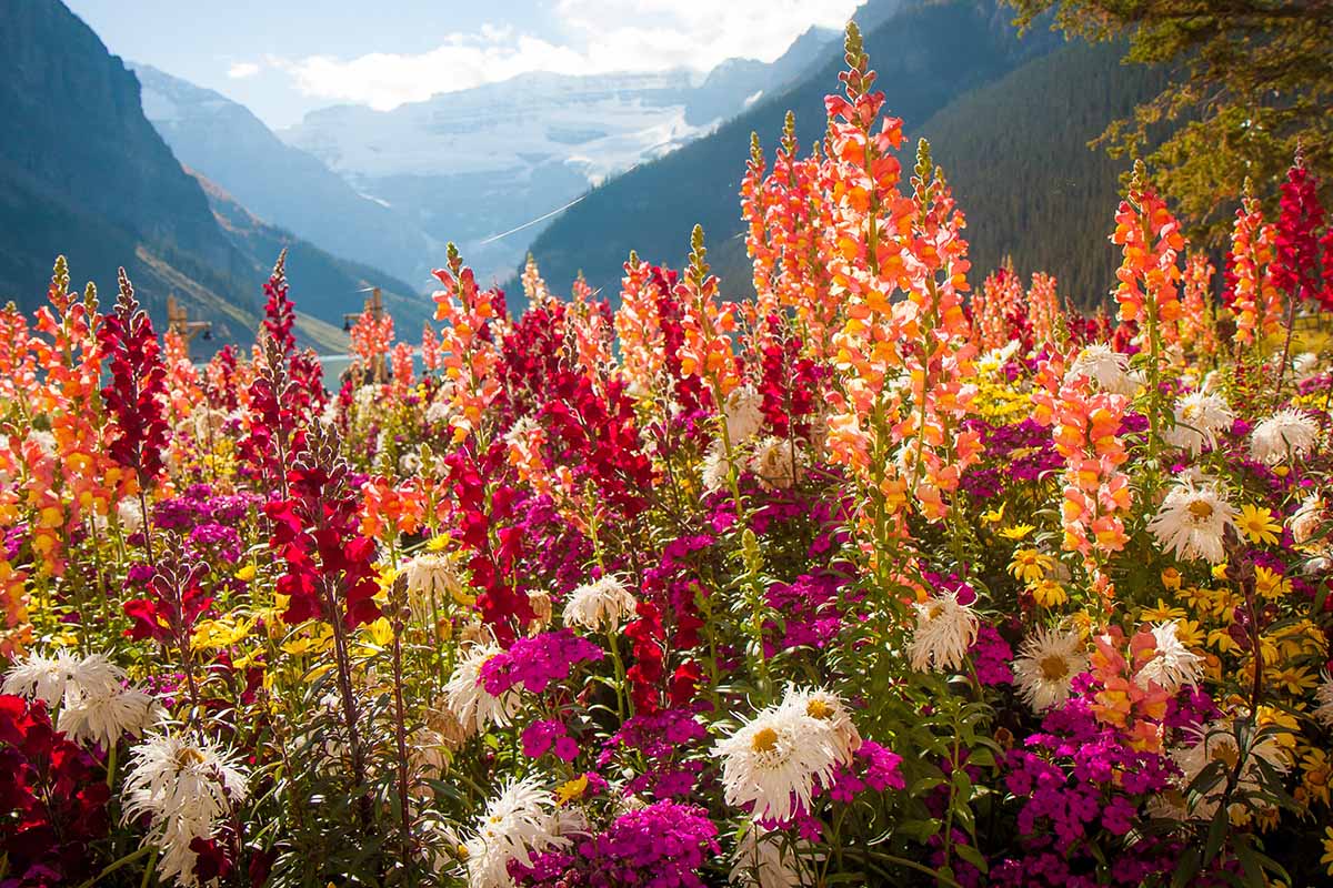
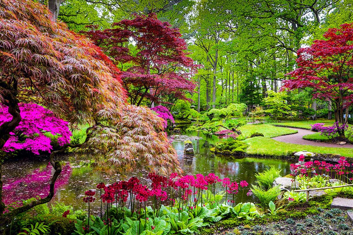
Brightly hued flowers and alluring foliage are among the first things most of us notice about ornamental gardens, but a little discernment when planting is needed to avoid a confusing and unsatisfying hodgepodge.
The simple solution to preventing color chaos comes from planning your palette before shopping for your plants!
Color, along with elements like form and texture, plays a key role in the overall composition of ornamental gardens and landscapes – and it’s an integral part to evoking particular feelings as well.
We link to vendors to help you find relevant products. If you buy from one of our links, we may earn a commission.
And with just a basic understanding of how different shades work together, you can easily create your own signature garden palette that creates a range of moods to fulfill your vision… and saves money too!
So if you’re ready to put tints, shades, and hues to work for you in your dream landscape, keep reading to discover how to create glorious garden color schemes.
Here’s a brief look at what you’ll find ahead:
How to Use Color in Your Garden Design
Plan Your Design
To best create the composition you want, planning it out first – before planting – pays big dividends.
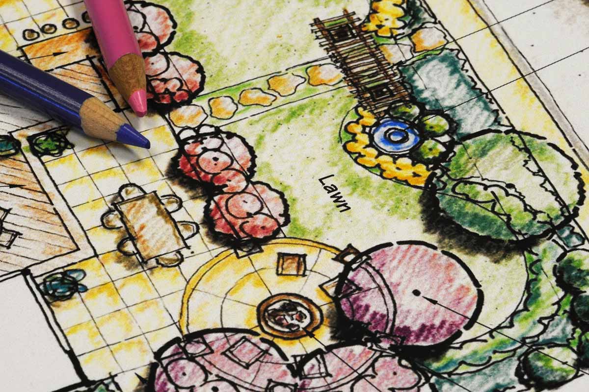
A box of pencil crayons and a sketchbook can help clarify your vision or you can use a site like Pinterest to make a board or two to help visualize your ideas.
Visiting local botanical gardens and observing how the pros use color in their designs is another excellent source for inspiration.
Use the following tips to help develop your ideas:
- Start by considering the basics such as the size of your garden or yard, how you like to use your outdoor space, and how the sunlight moves through the day.
- Decide on the overall energy or mood for your garden, using the temperatures of different hues to evoke certain emotions.
- Warm shades like orange, red, and yellow are lively and energetic, imparting a sense of excitement, while cool hues like blue, green, and purple are calming and lend a sense of tranquility.
- Use a color wheel to help with selecting your favorite hues – more on that in a bit.
- Start with only one color. I know this can be hard but simplicity is your friend when you’re getting started. How to add accents and supporting shades is covered later in this guide – so keep reading!
- It’s helpful to look at the existing elements on your property to choose your single starting shade because it has to work with your setting, including fences, hardscape features, house paint, and outdoor furniture.
- If you plan to build or finish hardscape structures like arbors, fences, and sheds, try to avoid using green paint, which often conflicts or distracts from the natural shades of plants. Instead, stick to neutrals or tints that occur naturally in your environment.
- Pick a theme you want to work with. Would you like a traditional cottage garden, a courtyard sanctuary, or are you drawn to a seaside or southwestern vibe? You’ll find more ideas in the Garden Styles section below.
- Whatever you decide, use your theme as a loose template to build on – but remember, there are no hard and fast rules about what a garden “should” look like. This is your space, so have fun with it!
- Refine your vision. After you’ve decided on the basics of a single, predominant hue, the temperature or mood, and the style you’d like, start to play with secondary shades, color combinations, and focal points.
- Keep in mind that the overall impact of massed plants is often more effective than single plantings. Consider where you can develop areas in drifts, groups, or stands for maximum impact.
- When honing your vision, keep a few design elements in mind. Use the principles of balance, contrast, emphasis, and repetition to create flow and unity, and to move your eye through the landscape.
- It’s also important to pay attention to where the light falls in your yard. Pastels can appear washed out in glaring sunlight while bright, saturated hues can provide an extra punch to shady areas.
- Once your basic plans are in place, start to consider your plant selection. Your choices need to provide the hues you want, suit the growing conditions in your garden, and be a suitable size for your space.
- And be sure to include some pollinator-friendly native plants that suit your palette – they’re proven performers for your particular climate and are often low maintenance.
Make sure you have a solid plan in place before visiting your favorite garden center – it’s the best way to avoid disappointment and save money!
Color Theory Fundamentals
For a better understanding of how a variety of hues, tints, and shades work together, a color wheel is an inexpensive and invaluable tool that explains the relationship between different colors.
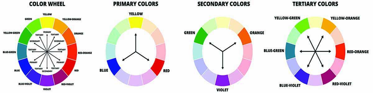
Most of us are familiar with the three primary shades of blue, red, and yellow.
But there are also three secondary tones, which are obtained by mixing two primary shades.
Green is the result of mixing blue and yellow, purple comes from combining blue and red, and orange is a combination of red and yellow.
And there are also six tertiary shades, the results of mixing one of the primary hues with one of its adjacent secondary shades.
For example, combining red (primary) with purple (secondary) gives us magenta.
You can go further down the rabbit hole into quaternary hues and beyond, but for the purposes of garden planning, the first three sets of shades are ample.
Most professional garden designers limit their palette selection to two hues plus green.
And really, I highly recommend you pick up a color wheel – they’re dirt cheap and along with garden design, they’re useful for art projects, choosing furniture, redecorating your home, and wardrobe coordination.
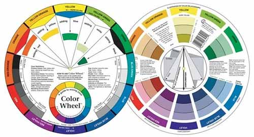
Color Wheel 9.25 Inches
You can find nine-and-a-quarter-inch color wheels available via Walmart.
Warm and Cool Tones
To get a feel for creating particular moods, it helps to understand the level of emotional “heat” that different hues impart.
Warm tones – those on the red side of the wheel – such as orange, magenta, red, and yellow are vibrant and lively, providing a sense of energy and excitement.
They also tend to advance in our perception, causing them to stand out and making them noticeable from a distance.
Cool tones – on the green side of the wheel – like blue, green, purple, and violet are more calming, with a soothing, tranquil quality.
Cool tones are often subdued and we tend to perceive them as receding, causing them to fade out from the eye.
This makes cool shades better for up-close viewing.
Neutral shades include black, brown, gray, silver, and white, and are often used to make bright hues pop, or on their own they can lend an air of drama or mystery.
Color Schemes
You can use any combination of hues you like, but for the beginner it’s often wise to employ established, harmonizing schemes to deliver the results you’d like.
To get you started, here are three easy plans that are frequently used for garden designs:
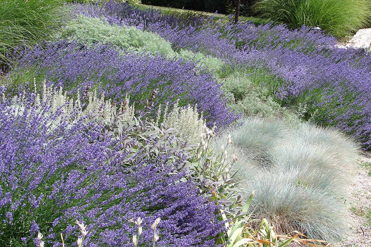
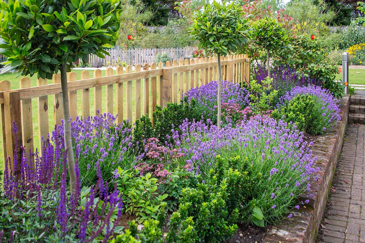
1. Analogous
Analogous plans use three shades that are next to each other on the color wheel.
Because of their close proximity to each other, they offer little contrast which gives a sense of balance, cohesion, and unity.
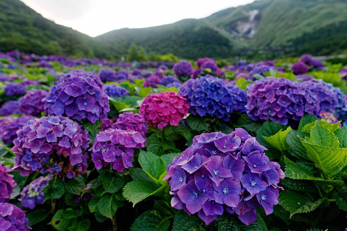
As an example, let’s say purple, a secondary hue, is your lead shade. In an analogous plan, you could pick the two tertiary shades of violet and magenta as supporting colors.
Or you could opt for purple (secondary), magenta (tertiary), and red (primary).
For a purple analogous plan, you can grow shrubs and vines like bougainvillea, butterfly bush, clematis, hydrangea, lilac, rhododendron, and wisteria.
Corresponding purple-toned colors can be found in plants like allium, aster, bellflower, blazing star, delphinium, geranium, iris, lavender, oregano, petunia, phlox, sage, and verbena.
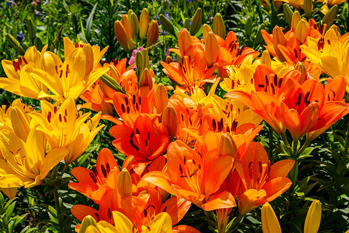
2. Complementary
A complementary plan is very simple and uses two tones that are located opposite one another on the color wheel, like blue and orange.
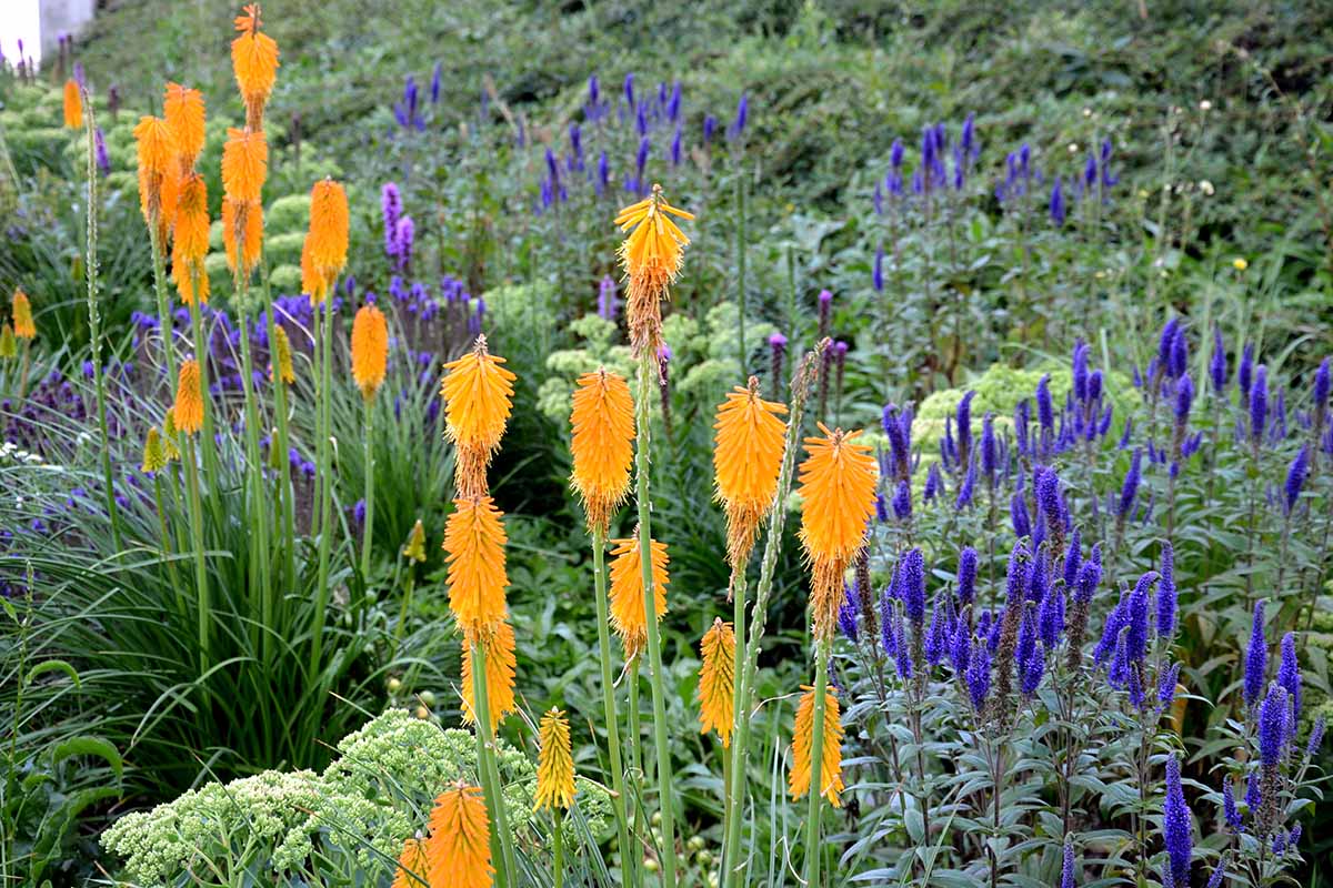
Complementary shades work well together because they balance one another, but also provide oodles of energy as they have high contrast, and contrast draws the eye in.
This is an excellent scheme to create focal points that really pop!
In the garden, a complimentary design works best when one shade is chosen to lead and its complement is used as an accent.
Using the blue and orange example, you could lead with blue-toned shrubs, vines, herbs, and flowers like California lilac, clematis, hydrangea, lily of the Nile, morning glory, plumbago, rosemary, Russian sage, salvia, speedwell, and sweet peas.
Complementary orange-flowered plants can include the likes of begonia, calendula, California poppy, canna, celosia, chrysanthemum, crocosmia, dahlia, daylily, gerbera, lily, marigold, and nasturtium.
3. Monochromatic
A monochromatic scheme is minimalist in nature and is one of the easiest to create because it uses only one color with some variations of that shade.
A monochromatic plan presents a harmonious, relaxing scene that’s easy on the eye.
It uses one color and a variety of hues, tints, and shades to create a layered look with an air of easy elegance and has the knack of making small areas appear larger.
This is a low-contrast scheme but offers a myriad of tone changes to keep the viewer engaged and interested.
Choose one predominant shade then select lighter tones to add depth and movement and darker ones for accents or to draw the eye in.
Consider the color pink – with well over 100 shades, pink is superb for a monochromatic garden.
For an effective pink design, you could work with shrubs and vines such as azalea, bougainvillea, camellia, clematis, crape myrtle, daphne, deutzia, elderberry, fringe flower, hibiscus, hydrangea, lilac, rhododendron, rose, and weigela.
Pick supporting shades and accents from flowers and herbs like anemone, astilbe, bee balm, begonia, coneflower, dianthus, foxglove, hyacinth, impatiens, lavender, Asiatic and Oriental lily, mint, oregano, salvia, and peony.
Garden Styles
To help achieve the particular look you want, brainstorm some popular garden styles.
And while you’re thinking of a theme or the general characteristics of your design, make note of where your outdoor accents, bits and bobs, decor, furniture, and so on fit into your plans.
Here’s a sample of themes to get the creative juices flowing:
- Containers – using pots and planters instead of garden beds is ideal for balconies, patios, and small spaces
- Contemporary – also known as a “modern garden,” this theme uses clean lines and geometric elements to create your outdoor living space
- Courtyard – a small space typically enclosed by walls or buildings
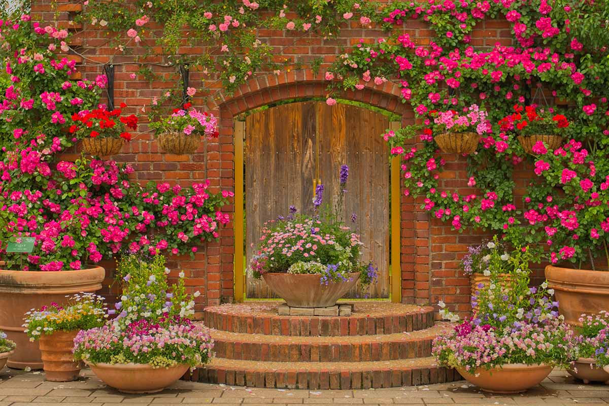
- Cottage – the quintessential English garden full of brightly hued flowers and favorite old-fashioned plants
- Meadow – a loose construction that utilizes mostly native flowers and grasses
- Meditation – spaces designed to foster a quiet, still atmosphere for peaceful relaxation
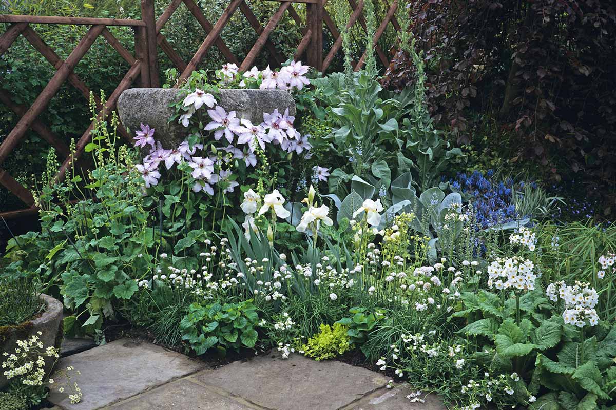
- Moon – employs mostly white and silver plants to be enjoyed in the moonlight
- Rock – uses a framework of boulders, gravel, or rocks for plants that require little soil or water
- Seaside – requires robust plants that can handle sandy soil, salt spray, and strong winds
- Shade – takes advantage of naturally occurring shady areas with little or no direct sunlight
- Small – small outdoor spaces with big potential for creating mini-Edens
- Southwestern – uses waterwise cacti and succulents plus design elements like adobe and gravel for cultivated desert characteristics
- Vertical – makes use of vertical planes for upright plants like vines on support structures or to create a green wall
- Xeriscapes – landscapes designed with drought resistant plants to reduce or eliminate the need for supplemental water
- Zen – a minimalist, dry landscape using boulders, gravel, or sand with only a few plants
For help with visualizing your plan, a design workbook can be helpful.
This “Design Your Garden Toolkit” from Michelle Gervais has fun reusable stickers to help you really nail down your ideas.

Design Your Garden Toolkit
You can find this book available via Amazon.
Plant Selection
Finally, after planning and refining your dream, you can start selecting plants to provide the colors you want.
Look for plants that give more than just your favorite hue. Try to select those that provide multiseason interest.
Along with flowers, look for color changing bark or foliage, berries and fruit, or interesting seed heads.
To reduce the number of plants needed, opt for those that have a long flowering season or ones that rebloom.
For visual stimulation, include plants in a variety of sizes, different forms, and distinguishing textures.
Layer your plantings for continuous and diverse displays. Make use of annuals, bulbs for spring, summer, and fall, grasses, herbs, evergreen and deciduous shrubs and trees, native species, perennials, and vines.
And don’t forget about the interest provided by foliage.
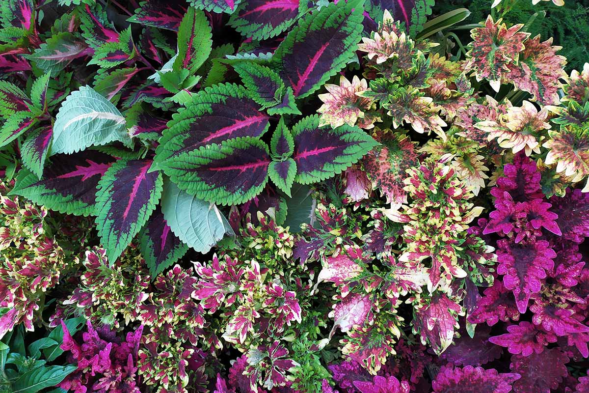
Green leaves are most often used for a soothing background or to support focal points, but many plants provide bright, colorful foliage as well.
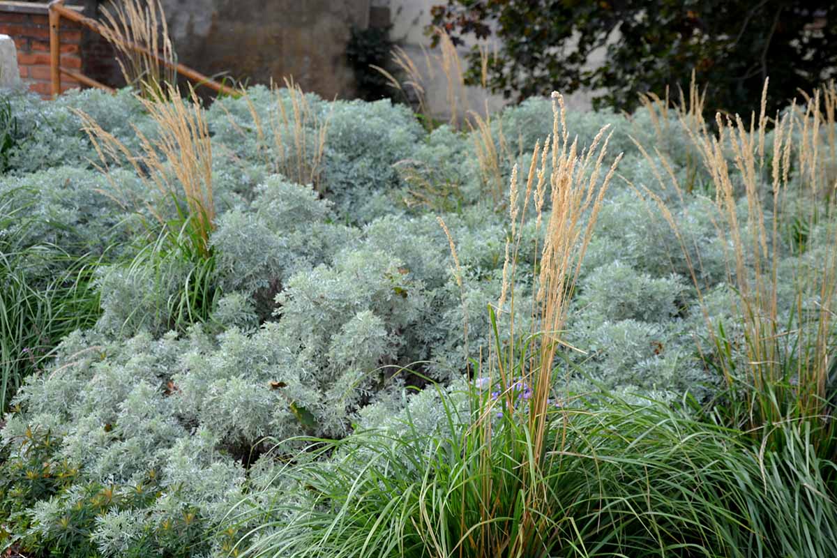
For variations of green or shades of blue-green, burgundy, chartreuse, gold, orange, purple, red, silver, and yellow, look to varieties of artemisia, caladium, canna, coleus, coral bells, ferns, hosta, lamb’s ear, ninebark, smoke tree, sweet potato vine, and ornamental grass.
If desired, you can also include berry, fruit, and veggie patches or cultivate your crops in containers.
Many edibles add interesting foliage, attractive flowers, and alluring forms as well as being tasty!
Polished, Professional Gardens
Knowing how to use color in the landscape is one of the fundamental skills required to create polished, professional looking gardens.
It helps to set a mood, influences styles, and acts as the glue that holds everything together.
But you don’t have to be a professional designer to use color yourself!
Stick to the basics by planning your vision first, including your favorite shade and the style you’d like. Then find a color scheme to develop but remember to keep it simple – work with one main hue and two supporting players.
And don’t stress if you can’t find plants that are an exact match to those on your color wheel model!
Be flexible and work with what’s available – you’ll love the many “happy accidents” that result, along with a beautiful outdoor space.
What are some of your favorite garden color schemes? Tell us your thoughts in the comments section below.
And If you’d like more flower garden tips, read these guides next: